Minimal app design is beauty combined with precision. As it is said, Minimalism is an appreciation of space. Not only in our daily lives but even in mobile app design the quote “Less is more” has found a strong footing with the app design community. It’s important that even though minimalism is a concept still emerging over the last few years, but it’s being noticed and appreciated by the designers and end-users alike. Let’s find out more!
Table of Content hide
1 What does Minimalism symbolize?
2 Key features of Minimal App Design
3 Benefits of Minimal App Design
4 Application of Minimalism in Mobile App Designs
4.1 Flat Designs
4.2 Monochrome or Narrow Color Palette
4.3 Captivating and Animated Typography
4.4 Restriction of Elements
4.5 Prioritization of the Idea of Visual Components
4.6 Brief and Concise Navigation
4.7 Making Correct use of Negative Space
4.8 Grid View
4.9 The contrast of Visual Elements
5 Takeaway
6 Recommended reading, tools, and templates
What does Minimalism symbolize?
Minimalism is a very widely used concept in many art forms including literature, music, and design. It depicts a style that offers a very simple view to people, with sparse (but not lacking) details. In terms of mobile app design, minimalism loosely is about drawing the focus of the user on a particular action/task/information by effective use of space.
History Time!: Minimalism got famous in New York during the 1960s when the design in fine arts was shifting from classic towards abstract and geometric painting and sculpturing styles. Minimalism is to date linked with Bauhaus, Constructivism, and similar concepts of visual design.
With minimalism in mobile app design, the focus is mainly on letting users know what is an important part of the app, giving them a very clear idea of what to expect from your app. The concept of this design is to enhance the focal point of the message and give a clear indication of what message the designer wishes to send across to the users. While minimalism focuses on certain shapes, colors, spaces, and compositions, the idea is to highlight and organize what the app has to give to its users.
When working with a minimalistic approach, the mobile app designers make the User Interface hassle-free but not bare. This design is also trendy and not overcrowding the visuals. The use of negative space, selective gallant colors supported by well-planned font styles, and minute details make minimalistic apps’ UI very easy and fun to use. While the designs are meant to be simple, mobile app designers have to pay close attention to not make the app very basic and boring. The reason minimalism is a daring concept is that many app designers struggle with fitting large content within small and limited spaces – hence making this visual style a rather risky app design concept.
Key features of Minimal App Design
Minimalism is often linked to a certain school of thought in terms of what this visual style must represent and include. Here are some of the most prevailing features of minimal mobile app design:
- Clean Design
- Precision
- Visual Order
- Well-Planned Design Composition
- Design Component Functionality
- Well Organized Negative Space
- Importance to Major Components
- Effective and Capturing Typography
- Discarding of Non-functional Design Rudiments
Although, it is a rather exhaustive list you can see why minimalism is a great mobile app design concept with all these well-planned UI components. Minimalism is visually and functionality-wise one of the most user-friendly UI designs. It makes your app look urbane, neat, and focused. This is also a brilliant concept to follow since User Experience (UX) relies on clean aesthetics being one of their most desirable factors.
Benefits of Minimal App Design
Visual Appeal: With its aesthetic appeal, an app designed with a minimalist approach tends to contribute a lot in user retention.
Call To Action: As the focus on the screen is always drawn to the “intent” of the screen i.e action, information, navigation, etc. Due to its simplicity its always easy to bring user attention to the intended task to be executed on that specific screen in the app.
Minimal Apps are Faster: Without a doubt, minimal app design makes app faster due to the fewer number of elements to be loaded on the screen. This is probably one of the most important factors which contribute to amazing user experience.
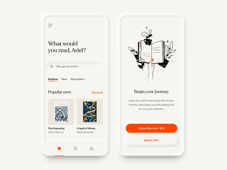
Application of Minimalism in Mobile App Designs
In digital design, including web design and mobile app designing, minimalism is one of the most prevalent design styles. Here are some of the key characteristics of this design style.
Flat Designs

A flat design is a two-dimensional visual element that is extremely unrealistic upon viewing. Flat design elements usually consist of lesser elements such as curves, highlights, shadows, gradients, and textures – which make it easier for application in minimalistic mobile app designs. Most flat designs are usually vectored by nature and are great as icons, buttons, imagery, and illustration. These flat designs tend to look neat in various sizes and resolutions, making it a great element for mobile app designing. Flat designs allow mobile app designers to enhance app usability and visual accord in the app UI.
One thing mobile app designers must always keep in mind is that minimalism and flat designs are not the same concepts. UI designers must carefully comprise of flat designs within the minimalist interface to maintain visual harmony within the app. These flat designs are only icons, buttons, and illustrations that complement the visuals of minimalistic app design. Minimalism is a very vast concept dealing with the entire mobile application’s visual format, and hence has many more components such as color palettes, contrasts, and many design elements. Hence, flat designs are merely a design practice within the entire sphere of minimalistic design.
Monochrome or Narrow Color Palette

Colors play an extremely important part of an app’s design, but it becomes extremely crucial to deal with colors in the right way when designing a minimalistic mobile app design. The best choice for any mobile app designer is to limit their choice of colors and stick to either monochromatic color schemes or choose from a minimal set of colors from the color palette. This process of selecting a color scheme for the app is crucial because it helps to set the tone of your app and helps in implementing a poignant as well as an enlightening conversation with the app users.
When the colors are limited, mobile app designers can use this to their advantage to make users focus on using the app more, leading them to carry out actions such as subscribe to the app features, making in-app purchases, and many more. Since colors play a strong role in affecting the psychology of users, using particular colors liberally can evoke stronger emotions among users when they utilize the app.
Recommended Read: Dive deeper into color psychology in app design.
Captivating and Animated Typography
Bold typography is seen as one of the strongest aspects of minimal mobile app design. The typography within an app sets the style of the app, along with obviously adding content. Typography also helps with improving the visual quality of an app that has been designed minimally. How a mobile app designer uses the graphics and text also includes carefully mapping out to font styles, colors, and complimentary styles along with the sizing of the text. Typefaces, graphics, and complimenting color schemes within a mobile app make the app user-friendly and encourages user retention since it sets a tone to the app. Another important aspect of typography within the app that should not be missed it the readability and precise, legible text.
Restriction of Elements

When designing a minimal app, it becomes crucial for the mobile app designer to consider the amount of information that is displayed on a page within the app. This is important because minimalism encourages a carefully planned distribution of visual elements such as imagery, text, etc. on a page to avoid overcrowding of visuals. This helps users in the way that it does not provide the users with too many navigating options or information to focus on. Important factors to avoid overdoing on a screen of the app are content, color palette, imageries, icons, and other details. The main aim of doing so is to allow users to enjoy quick and easy navigation within the app pages.
Prioritization of the Idea of Visual Components

When working on a minimalistic User Interface, designers must take precautions to not go overboard with the images. They should choose the most important visual elements and compliment the imagery to it. This allows the designer to set a no-nonsense tone within the pages. It also makes it easier to set the mood of the users that is appropriate for the app. Designers must pay attention to the imageries as well. This ensures that the pictures used within the app also stick to the concept of minimalism. If this goes wrong, the entire app layout and its concept of minimalism can be compromised.
Brief and Concise Navigation

When designing a mobile app to be minimalist, designers must make sure to highlight and prioritize all the elements within the app. Only the most important elements within the app must be added, while others should be demoted or be eliminated. There are many ways to do so, but this process helps users access the important parts of the app easily. Minimalism is often criticized is for this reason – it becomes difficult to pinpoint the most crucial elements of the app. Minimalist designs tend to have many-layered pages and layout components. This could potentially irritate users, which is why a mobile app designer must make sure users aren’t left confused after using the app.
Making Correct use of Negative Space

The White Space is important for any design to allow a breather for visual elements. Negative space allows the designers to increase focus on certain elements of the app. Designers do not worry about incorporating colors or illustrations in the app. The negative space in any app design also compliments the monochromatic color scheme. Also, the limited use of colors generates contrast in elements, thus allowing legible content.
Grid View
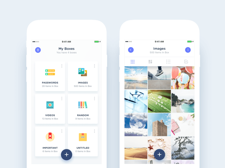
Grid view is an alternative to the standard list view in mobile apps. When designing a minimalist User Interface, it must be designed in a very organized manner. Action, content, and navigation should be clearly grouped, marked so as to avoid any guesswork from the user. This is particularly when the app has a lot of information to offer. A grid-based minimal UI makes it easier for users to navigate through the app. It also generates a much more positive response from users.
The contrast of Visual Elements
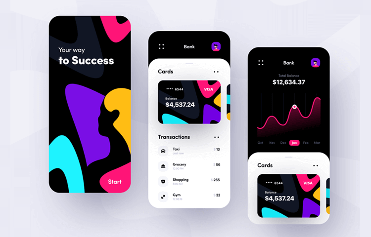
While minimalism depends on the selection of colors, shapes, and other graphic elements. It also depends on the contrast of the same. The most prominent sections of the app are meant to serve as a contrast to the remaining elements. A good minimal mobile app design relies on the correct use of visual elements and the contrast to important components.
Takeaway
While minimal mobile app design is extremely beneficial for mobile apps. It provides users with a fresh and easy to understand User Interface. This doesn’t necessarily go on to implying that minimalism is the best way to design an app. Many mobile app designing techniques can be used to achieve the user experience…the key here is to keep your eyes and ears on what your app users are saying.
Do check out these 10 Minimal UI app design inspirations.
Recommended reading, tools, and templates
Do let us know in the comments if we have missed any resources or tools that should be added in this article.