
When designing a mobile app, it is extremely crucial to decide what colors you want to use to make a maximum impact via the app. When it comes to colors, the human mind links different colors to different emotions and reactions. The same goes for mobile app designs and colors. Users may not realize the impact of colors that take place with every app they use, but it still affects them.
We’re here to talk about how different colors affect users in certain ways – and how UI can use these theories to design an impactful app. To learn more about how to use colors in the best possible way in UI designing practices for an app, keep reading.
Why Use Color Psychology?
Color psychology helps understand how certain colors affect viewers the way it does. This is a great factor to keep in mind when designing a mobile app when you want maximum impact when designing an app. Color psychology is extremely important in many aspects such as mobile app designing, mobile app development, mobile app marketing, etc.
When you design an app, one of the most important factors within that aspect is the color palette used. The colors used in an app’s design are the colors that are instead of how they want the users to feel. Colors used in the app’s UI convince users to feel and act a certain way. A study says that individuals make decisions solely based on the colors of the product from anywhere from 62% to 90%. It is common knowledge that color psychology can play a great deal in user retention – let’s find out how. A well thought out UI and integrated colors can enhance a user’s experience with your app.
What do Colors Represent?
To efficiently deliver the tone of your app’s design, you must understand what each color represents. UI Designers, mobile app marketing specialists, and other members involved in the app designing must be aware of what each color evokes in-app users. Here is a brief explanation of what each color represents.
Red

Red is generally a strong color, and it emits a similar feeling for users. The color could represent two separate extremes – either love or anger. The reason App UI Designers use red is to grab the user’s attention.
Red must be used wisely and sparingly to avoid extreme feelings of conflict for users when using the app.
Orange
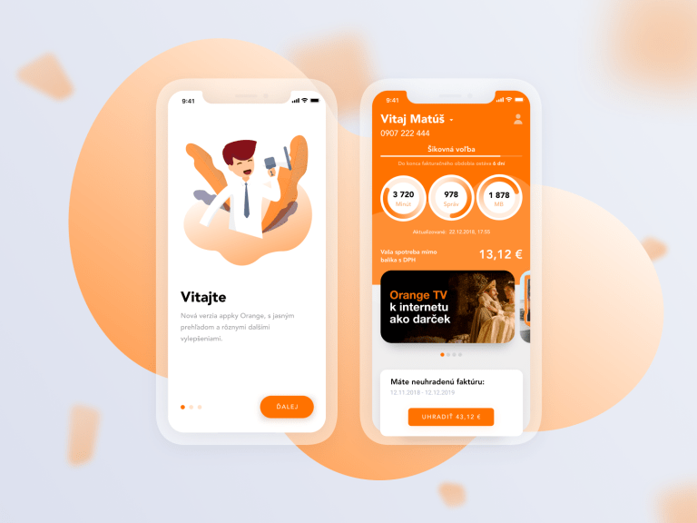
Orange is a color that emits excitement. It is warm, yet attention-grabbing at the same time. Orange represents power, friendliness, and excitement. The best use of this color is when you want to represent enthusiasm within your app UI.
Orange is usually the go-to color when mobile app designers want to add originality and zest in the App’s UI.
Yellow

As obvious as it sounds, yellow signifies sunlight, happiness and warmness. One thing designers must be careful about when they work with yellow is that it can become too overpowering in a design. This is because it is the easiest visible color to the human eye.
The color yellow is very powerful in designing an app; it stands for poise and encouragement. But when used in an overpowering manner, it can make users feel anxious beyond a certain point.
Green
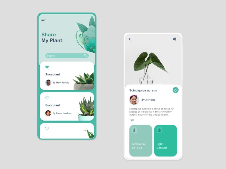
Green is a color that reminds app users of nature. It represents nature and stability. The color green in an app makes users feel calm and at ease – it stands for positivity.
One important thing about green in an app is that it stands for acquisitiveness. This is why green is perfect for apps that sell natures linked to nature.
Blue

Blue is the color of confidence. It is usually used when an app designer aims at designing a mobile application to be reliable and calming.
Despite the color’s attributes, too much blue in an app’s design makes it seem slow, distant and sad. Therefore, mobile app designers must be very careful to not overpower the app with blue.
Purple

The color purple is a color used to represent attributes such as royalty and affluence. The color is best used when dealing with luxury or similar concepts, or when representing concepts such as magic and mystery.
Since purple combines blue and red, an app with a purple design UI signifies firmness and control. Although purple is all about power and positivity, but too much of the color could disorient the user’s attention.
Pink

Pink represents positivity, kindliness, femininity and romanticism. Since pink is much softer than red, it creates a very positive and lovely aura when used within an app. This is also why pink apps often represent or are designed specifically for women.
The color pink within an app stands for strong, happy, and other emotions that users automatically associate with women and girls.
Brown
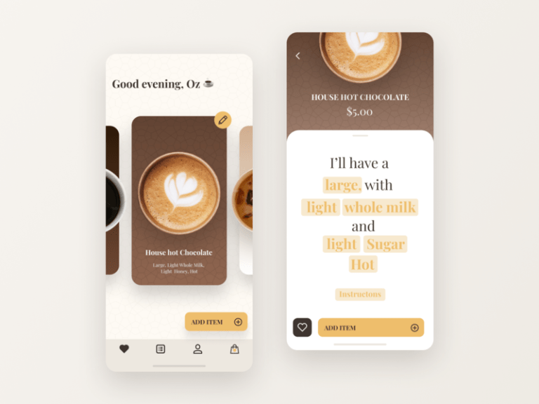
Brown is the color of earth and stands for security and familiarity – like nature. Brown is a color used by designers in varying shades to give different intensities of warmth.
Brown is often used by UI designers to depict comfort, or items that bring comfort. The color brown can also be used in an app’s UI to show understanding and support.
Black

Black is an extremely versatile color – which means it could have various meanings but usually stands for mystery. The color black when represented in an app’s UI – stands for traditionalism, modernity and sets a serious tone within an app.
Black does stand for broody moods, but since it is a versatile color it is used for contrast in apps. Black does extremely well as backgrounds to make colors stand out in the foreground.
White

White represents clarity, totality, incorruptibility, and cleanliness. This is why white is used in backgrounds to encourage app users to think and generate ideas. Despite of radiating motivation and creativity, it could be easy to overdo in an app.
Too much white in any app’s Design and UI can cause users to feel isolated and empty. White is especially used in backgrounds to highlight colors within the app, and for crucial features such as ease of text reading.
Mobile App Branding and Color Relativity
Designers have to carefully plan and apply the use of colors within any app’s design when creating the UI. Despite of colors being used within the app’s UI, an app’s branding speaks volumes and takes the app in the direction planned. Colors have a very clear and crisp representation when it comes to branding. These colors represent the following moods:
Red – Buoyancy, youth, and influence.
Orange – Welcoming, warm, and lively.
Yellow – Joy, cheerfulness, and affection.
Green – Tranquility, development, and wellbeing.
Blue – Confidence, refuge, and steadiness.
Purple – Luxurious, imaginative, and intelligent.
Black – Dependable, sophisticated, and knowledgeable.
White – Effortless, peaceful, and clean.
Conclusion
he psychology of colors is very crucial when you try to make an impact, hence the effort of choosing colors wisely when designing an app. Colors become a designer’s weapon when used correctly. Colors and its correct uses in any app’s Design & UI becomes a tool in understanding the app’s users and their demands – which the designer can comply with.
Here are some things you can take away from the above read:
- Make sure you plan your color scheme efficiently
- Ensure that your design and its colors are in sync with your app’s agenda and tone
- Recognize your target audience based on demography and use colors based on their common interests
- Always double-check how your app looks while in the testing phase (especially on different devices)
- Communicate with group leaders of target audiences to check if the colors of your app design are correctly implied
- Combine colors accordingly, based on what your app wants to communicate with its users.
uQcnlPGAwtML